It does take a village, as they say!
Creating an identity for African Girls Can was an evolutionary process that included bright minds from across the globe. Logos and colors are fun to work on, and more complex than you might think!

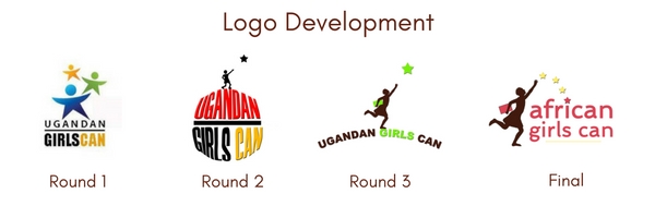
The initial logo design of “star girls” was proposed by Phoebe’s husband, Reuben Mulinde, who in addition to being a primary school teacher in Kampala, Uganda, enjoys graphic design. It was important to us that our logo convey strength, hope and possibilities.
Alecia shared the design with a neighbor friend for feedback. Raquel Kuperus  is a high school Senior in Boulder, Colorado, pursuing her IB diploma and with plans to pursue a degree in industrial design in the Netherlands after graduating. Raquel imagined a girl standing on top of the world, reaching her goals and attaining her dreams. She then came up with the innovative idea of using a silhouette of an actual 12 year old girl (her sister!) reaching for a star in the logo. Considering that 12 is the age at which girls in developing countries are at most at risk of dropping out of school, that seemed perfect. The book under her arm is a clear connection to school and the words are curved as if she is standing on a mountain top.
But, then, a hitch! We learned that the Ugandan government no longer allows the country name to be in newly established organizations. Turning on a dime, we checked to make sure the domain and corporate name of African Girls Can was available. Luckily, it was. This might also give us some flexibility in the future to provide scholarships in other African countries. However, something was still not quite right. The green and brown colors in the logo could imply that we do environmental work instead of education.
 So, the logo was again passed along to other friends who are marketing and website design professionals, Beth and Lance Robertson of Robertson Consulting Group in San Carlos, California. (The elegant, easy to navigate website is also their creation). Beth proposed the dark brown, pink and yellow color combination and did an exhaustive search of unique fonts. A few more stars were added for a hopeful attitude and cohesive look.
Voila, we have arrived! And, yes, that is still Raquel’s little sister in the logo, who has just started Middle School. Going to secondary school is something that many girls around the world only dream about – something we hope to remedy for some girls, and why we found ourselves designing a logo in the first place.

